Kopi store by Noke Architects
An Immersive store to dive
into the world of KOPI
—
Hello, design junkies!
Get your design hearts ready for the project we want to show you today!
Based in Warsaw, the jewelry brand KOPI founded by Natalia Kopiszka, decided to venture her brand to home decor and accessories. To follow that change the founder commissioned the architecture studio NOKE architects for the new retail space.
The unique interior is inspired by the designer and founder Natalia Kopiszka's travels to Morocco and French Riviera. When walking into the KOPI store in Warsaw, one can immediately feel like at a luxurious Moroccan tent in the middle of a desert.
“We aimed to create an interior that would give clients a completely immersive experience. The soft, irregular shapes of KOPI jewelry and the designer’s holiday inspirations were our starting point.” – Noke Architects.
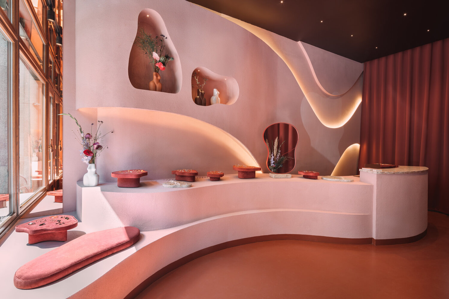
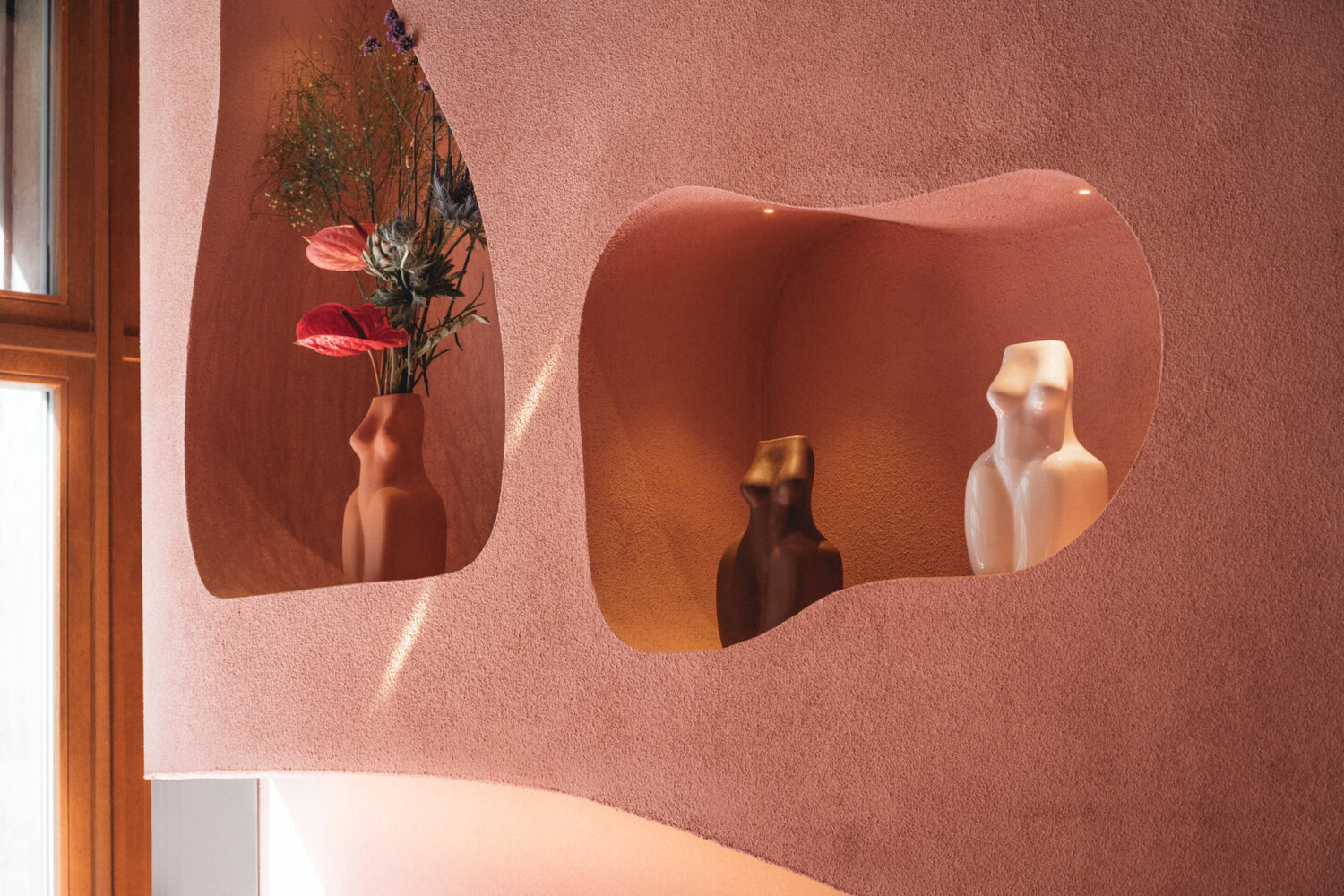
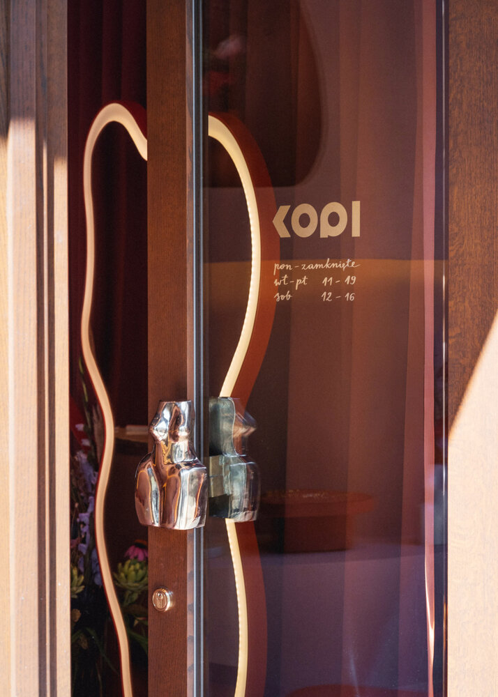
The characteristic storefront was designed under directives from the design of the building from the 20s. A Streamlined counter, dim Moroccan pink, and terracotta followed by a wall that looks like it is made of desert sand create a perfect background for the jewelry. Making all of the KOPI collections shine.
The desert-like atmosphere was achieved through the placement of the wavy wall behind the counter, which was made by artists with great attention to detail. It is covered with a thick coat of sand and painted with matte mineral paints. The characteristic recesses in the wall resemble cavities in rocks from the Atlas Mountains, making a perfect background for the organic forms of vases and candles.
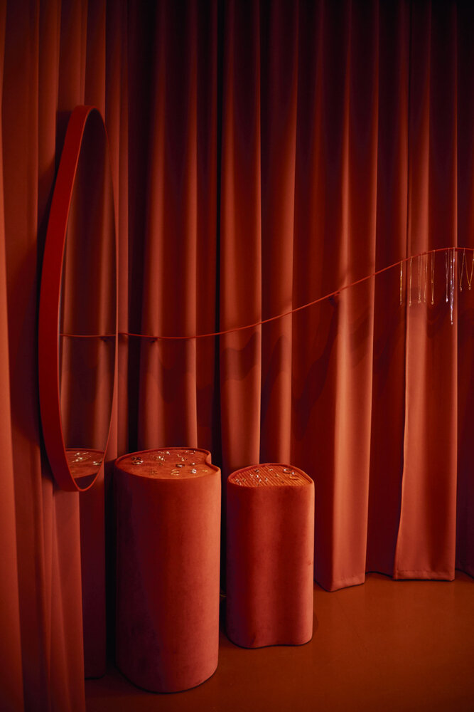
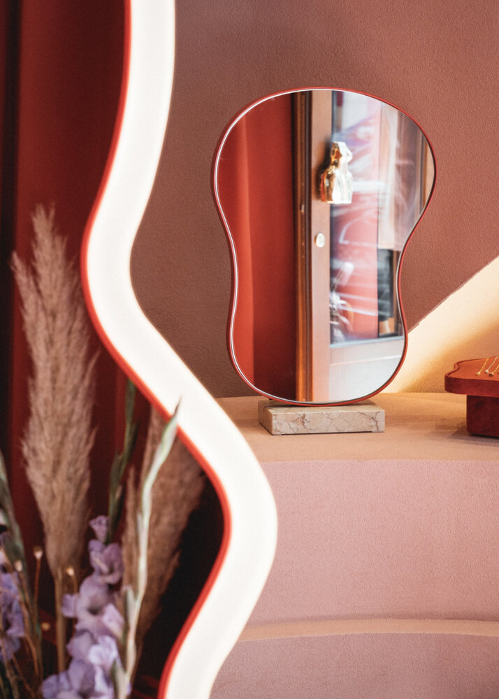
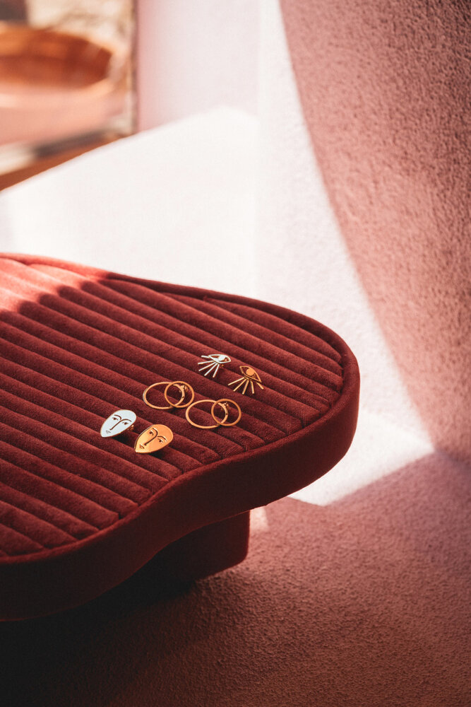
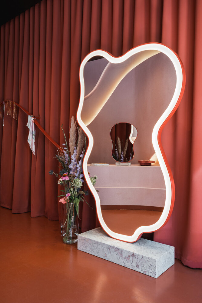
The wooden floor is oil finished to match the shade of the dark red ceiling. Illuminated with Molto Luce lamps, the ceiling resembles a starry night sky. The lamps, small in size but very bright, provide the best conditions for jewelry exposition. The mirrors alluding to the first KOPI’s collections inspired by the shape of a woman’s body, will become a part of the brand’s permanent offer. The dais made of pink Sakura marble complements other details of the interior. Such as the counter and the trays, which exhibit the most petite elements of the jewelry.
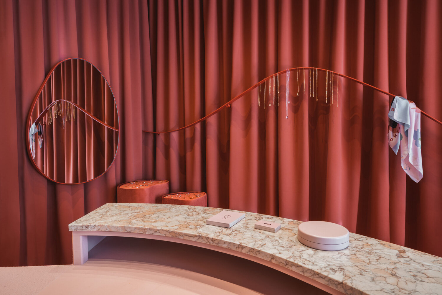
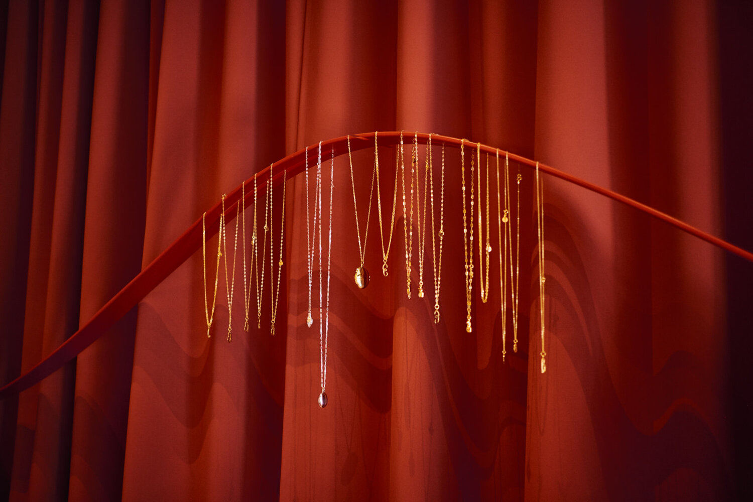
“We wanted to take a different approach to the elements of the exposition – that is how we came up with the idea to create a long minimalist ribbon which seems to levitate in front of the curtain” – Noke Architects.
The unobvious metal element is perfect for presenting necklaces and neckerchiefs from KOPI’s collections, and the upholstered jewelry trays made of soft velour correspond with the wavy shapes of the interior. Heavy curtains, upholstered seats, and poufs create a remarkable atmosphere that is so unique for a jewelry boutique.
The color palette associated with warm travel memories brings to mind the colors that are most associated with the brand. The matching shades of the curtains, parquet, and walls create a hypnotizing total look effect. That effect gives not only a unique shopping experience but also lets clients escape reality for a moment and fully immerse themselves in the world of KOPI.
If you enjoyed this article, you should check out our article about Radius 58.


