A lavish restaurant designed by Masquespacio
La Sastrería made with love for
the ocean, food, and neighborhood.
—
Hello, design junkies!
In Valencia (in the Canyamelar - Cabanyal neighborhood), a new restaurant, La Sastrería, has seen the light. Designed with an eye for aesthetic, the restaurant is a unique place - designed by our favorite award winning creative studio Masquespacio.
The restaurant's design takes its inspiration from the dream of chef Sergio Giraldo and bartender Cristóbal Bouchet to open their own restaurant La Sastrería, with the help of Grupo Gastroadictos. Like in most of Masquespacio's projects, the project has aimed to fulfill the illusion of a group of young entrepreneurs, seeking to offer a new culinary and sensory experience in Valencia - and we think that Masquespacio once again has accomplished their goal.
Located in the maritime neighborhood from Valencia called Canyamelar - Cabanyal, the restaurant designed by Masquespacio is divided into three parts, with a particular reference to Sergio's food. We love how the restaurant has been developed on different referential, creating an outstanding customer experience.
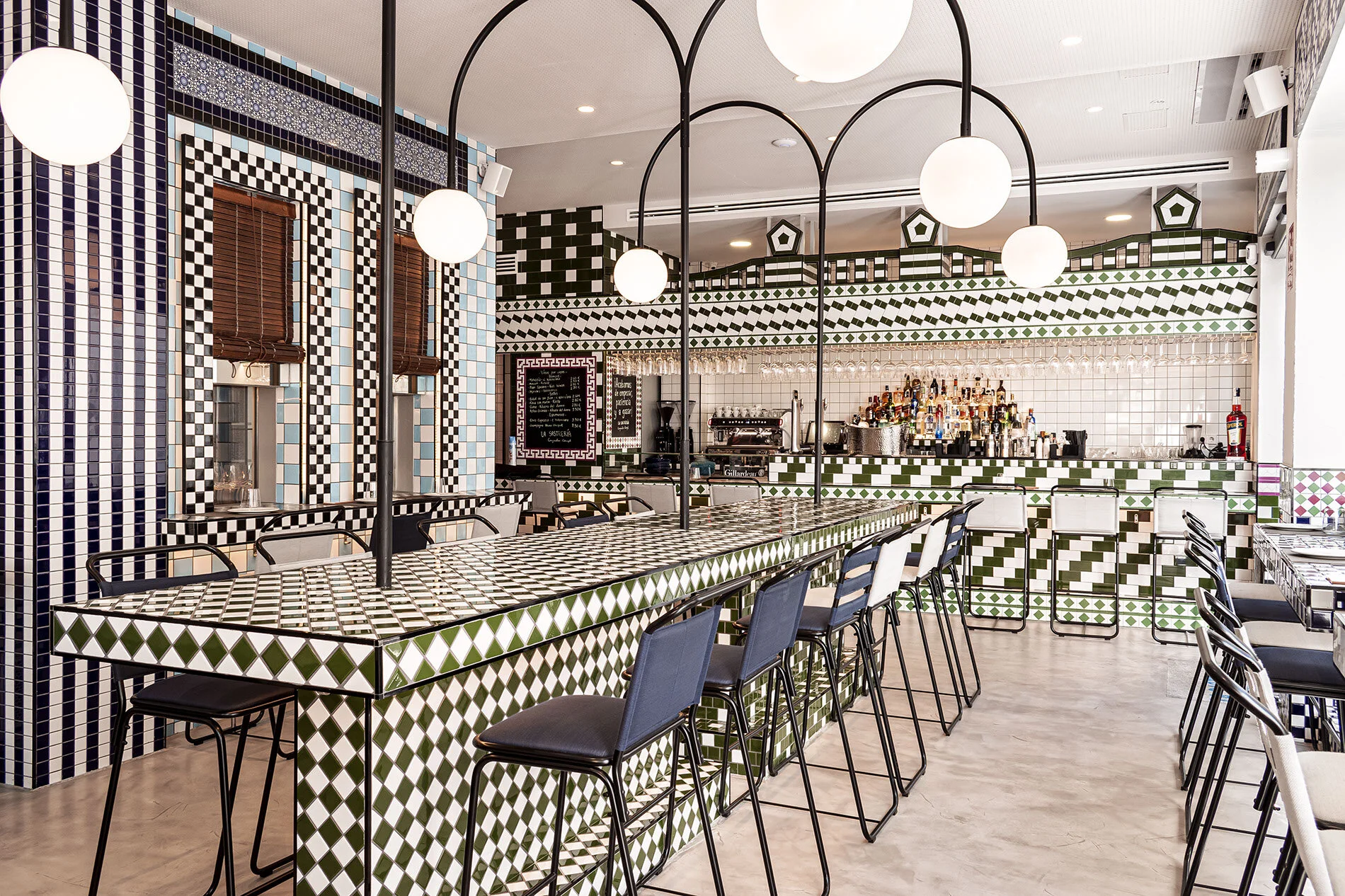
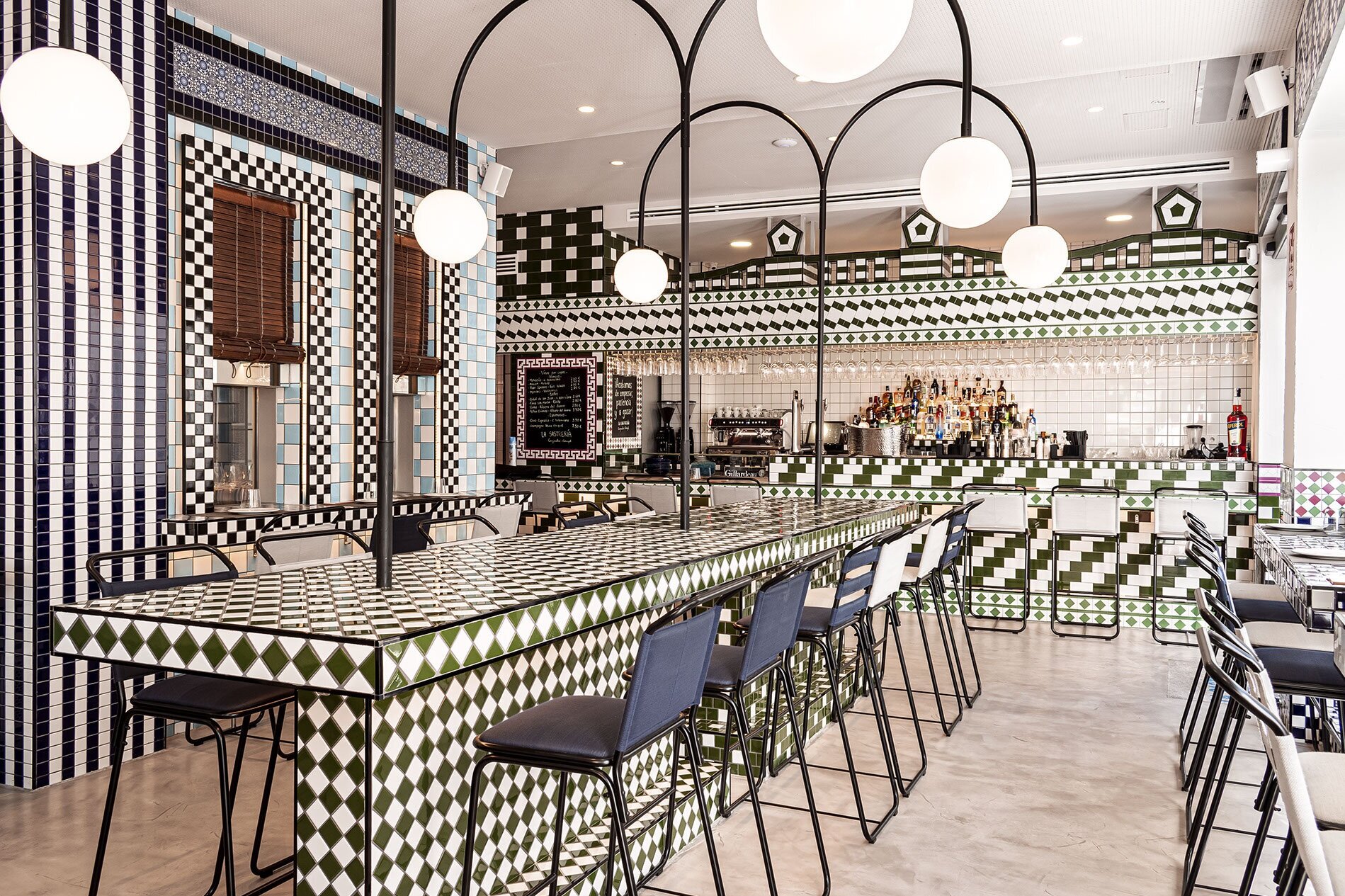
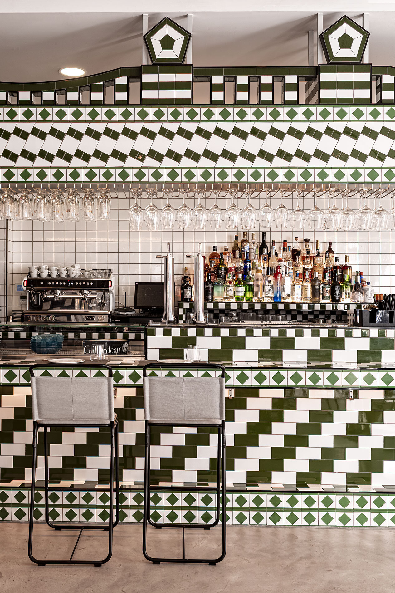
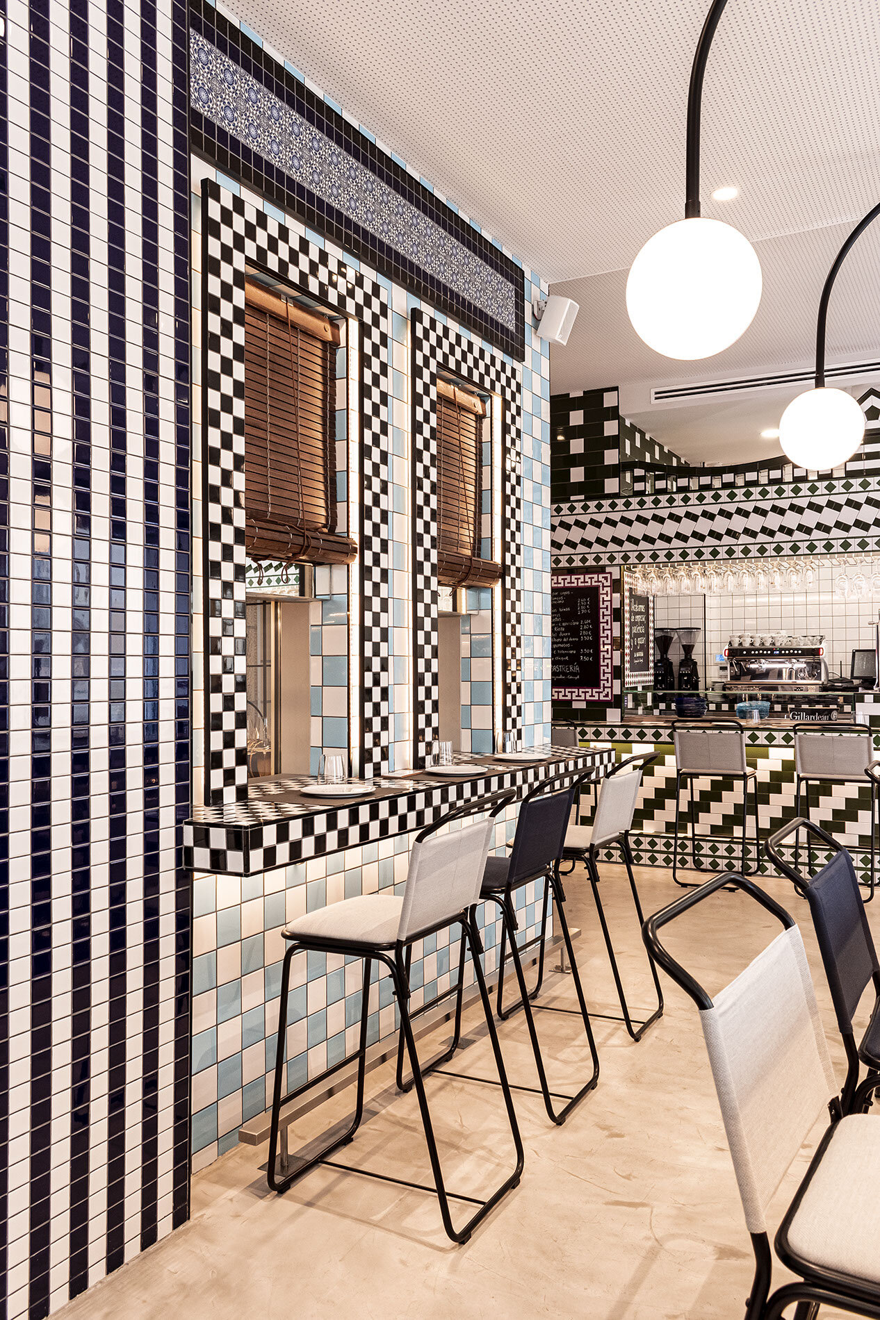
In the first part of the restaurant, a bar highlights the neighborhood through architectural references and the locals' way of living. This way, it represents the act of taking fresh air (Tomar la Fresca) during the warmest days, when the neighbors get on the streets with their chairs from home and come together for a chit chat.
“We tried to recreate the habit from the neighbors in the interior, amongst others through the reinterpretation of the plastic chairs they are used to take from their homes to the streets.”
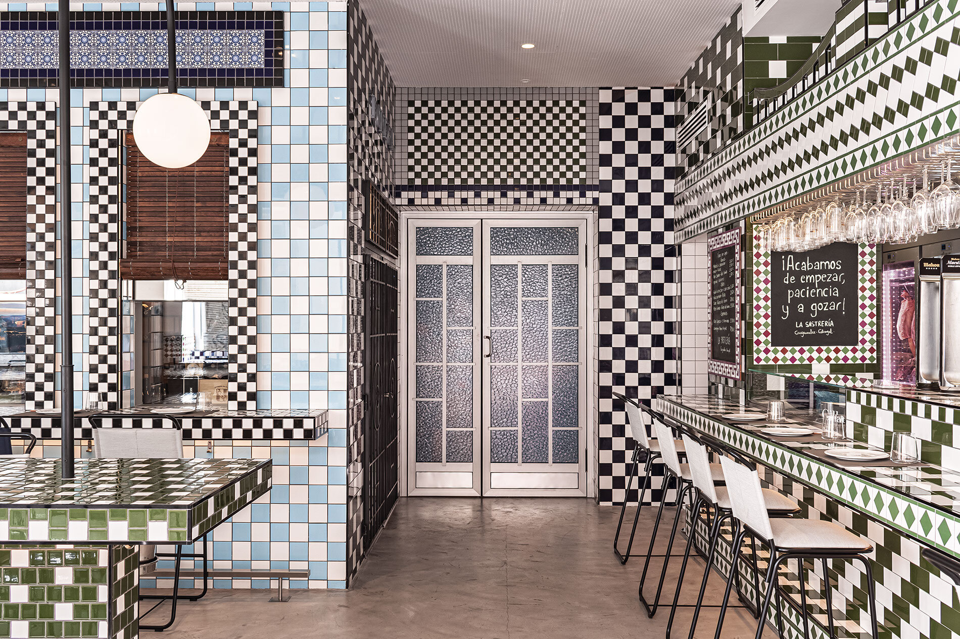
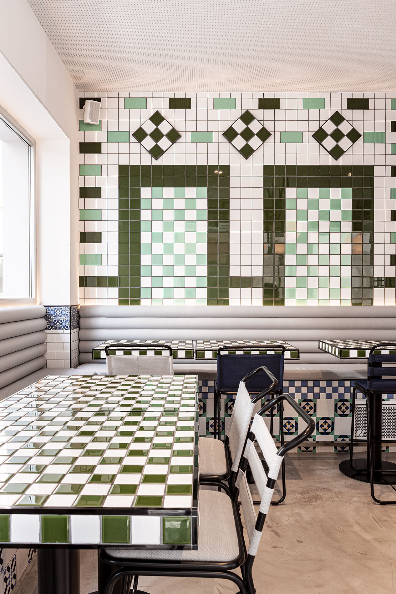
The design shows patterns made with customized tiles that reinterpret the façades from the neighborhood. Special attention has been given to the bar that looks like a façade on its own with ornaments and singular figures. In the middle, we can see how the attention is centered on selecting spirits that will be used for the cocktails, being the specialty from Cristóbal and La Sastrería. It should also be noted that in this space, Sergio's food selection is made of references from the neighborhood and products from the sea, always with a traditional focus, slightly reinvented.
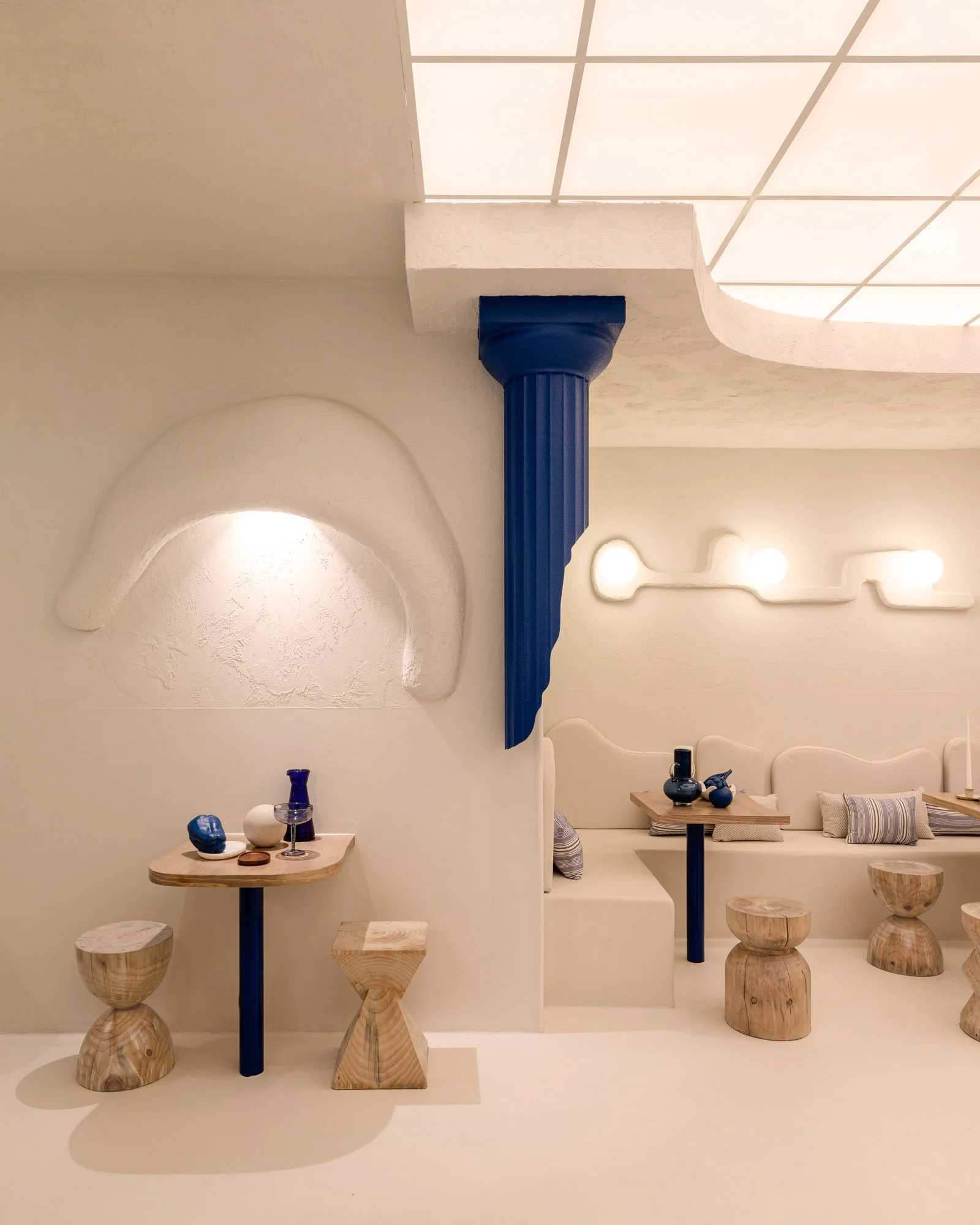
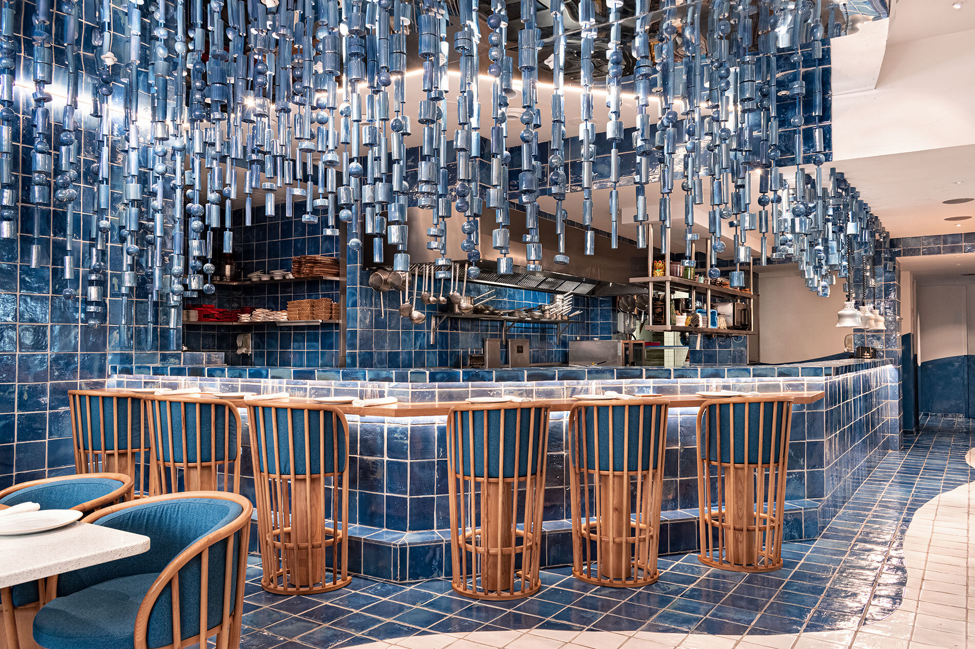
On the other hand, the second part of the restaurant in which Sergio made the most authentic sea-food is the venue's main attraction point. Hereby, the design recreates a huge wave that grows toward the kitchen and is traduced into a sculpture made of ceramic pieces. The floors of artisan ceramic in white and blue make us experience the division between the water and the sea sand, while the chairs designed for space are a reference to the fishing boats.
“Here we wanted to create a scene focused on the kitchen, submerging the whole restaurant like if you are in the middle of the sea, directed towards the most important part of the space. It’s pure fantasy like Sergio’s dishes.
”
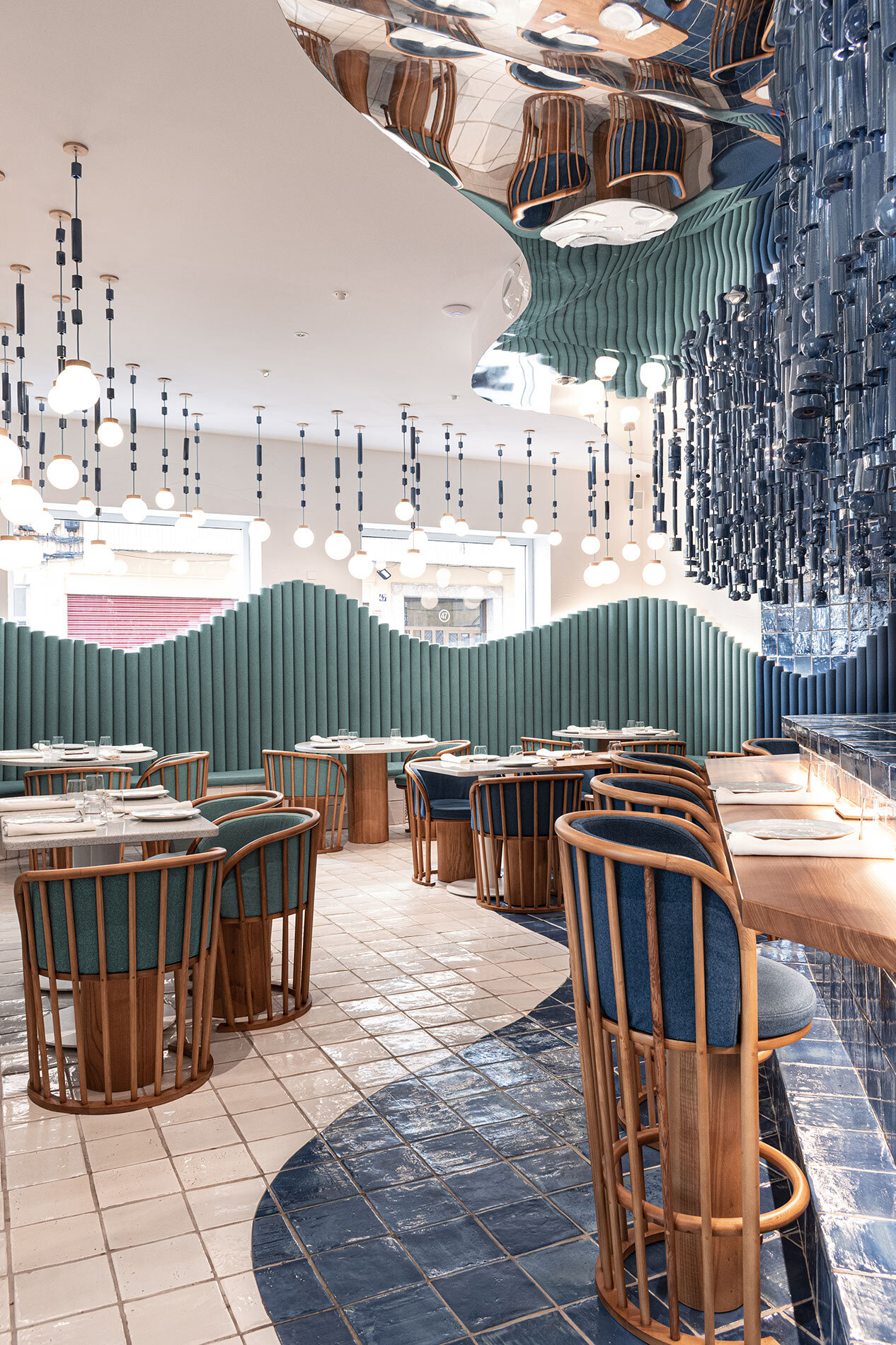
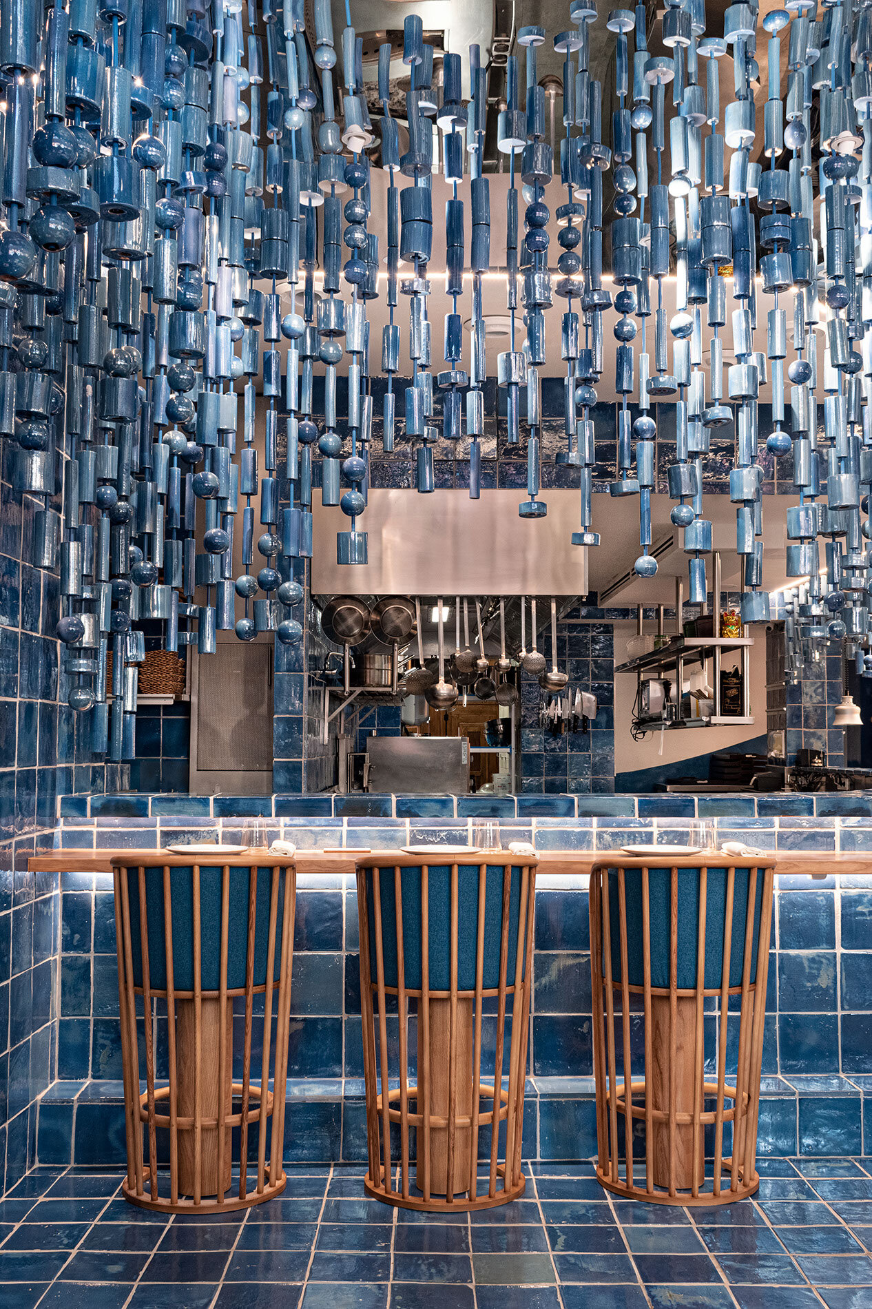
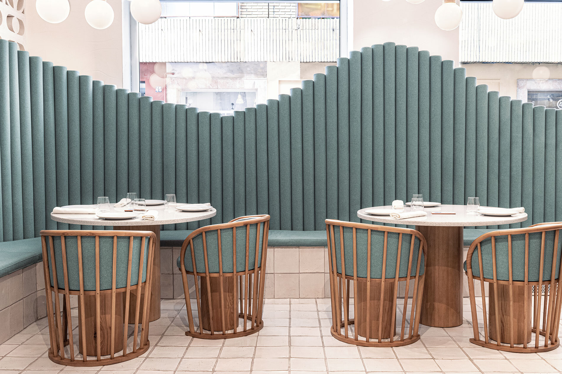
Last, behind the kitchen, the storage spaces are designed as a fish market. Concerning the materials, the primary approach was to use tiles in two different ways: custom-made with prints designed by Masquespacio for the bar zone, next to the handmade clay and ceramic tiles for the restaurant.
We love how Masquespacio has managed to both use the food, sea, and neighborhood to create a sensory experience whilst creating a beautiful place.
If you enjoyed this article, you should check out our other article about another beautiful universe made by Masquespacios.

